 This blog will share a new way to visualize data in a predictive coding project. I only include a brief description this week. Next week I will add a full description of this project. Advanced students should be able to predict the full text from the images alone. Study the text and try to figure out the details of what is going on.
Soon all good predictive coding software will include visualizations like this to help searchers to understand the data. The images can be automatically created by computer to accurately visualize exactly how the data is being analyzed and ranked. Experienced searchers can use this kind of visual information to better understand what they should do next to efficiently meet their search and review goals.
For a game try to figure out how the high and low number of relevant documents that you must find in this review project to claim that you have a 95% confidence level of having found all relevant documents, the mythical total recall. This high-low range will be wrong one time out of twenty, that is what the 95% confidence level means, but still, this knowledge is helpful. The correct answer to questions of recall and prevalence is always a high-low range of documents, never just one number, and never a percentage. Also, there are always confidence level caveats. Still, with these limitations in mind, for extra points, state what the spot projection is for prevalence. These illustrations and short descriptions provide all of the information you need to calculate these answers.
The project begins with a collection of documents here visualized by the fuzzy ball of unknown data.

Next the data is processed, deduplicated, deNisted, and non-text and other documents unsuitable for analytics are removed. By good fortune exactly One Million documents remain.

We begin with some multimodal judgmental sampling, and with a random sample of 1,534 documents. Assuming a 95% confidence level, what confidence interval does this create?

Assume that an SME reviewed the 1,534 sample and found that 384 were relevant and 1,150 were irrelevant.
Training Begins
Next we do the first round of machine training. The first round of training is sometimes called the seed set. Now the document ranking according to probable relevance and irrelevance begins. To keep it simple we only show the relevance ranking, and not also the irrelevance metrics display. The top represents 99.9% probable relevance. The bottom the inverse, 00.1% probable relevance. Put another way, the bottom would represent 99.9% probable irrelevance. For simplicity sake we also assume that the analytics is directed towards relevance alone, whereas most projects would also include high-relevance and privilege. In this project the data ball changed to the following distribution. Note the lighter colors represent less density of documents. Red documents represent documents coded or predicted as relevant, and blue as irrelevant. All predictive coding projects are different and the distributions shown here are just one among near countless possibilities.

Next we see the data after the second round of training. Note that the training could with most software be continuous. But I like to control when the training happens in order to better understand the impact of my machine training. The SME human trains the machine, and, in an ideal situation, the machine also trains the SME. The human SME understands how the machine is learning. The SME learns where the machine needs the most help to tune into their conception of relevance. This kind of cross-communication makes it easier for the artificial intelligence to properly boost the human intelligence.

Next we see the data after the third round of training. The machine is learning very quickly. In most projects it takes longer than this to attain this kind of ranking distribution. What does this tell us about the number of documents between rounds of training?

Now we see the data after the fourth round of training. It is an excellent distribution and so we decide to stop and test.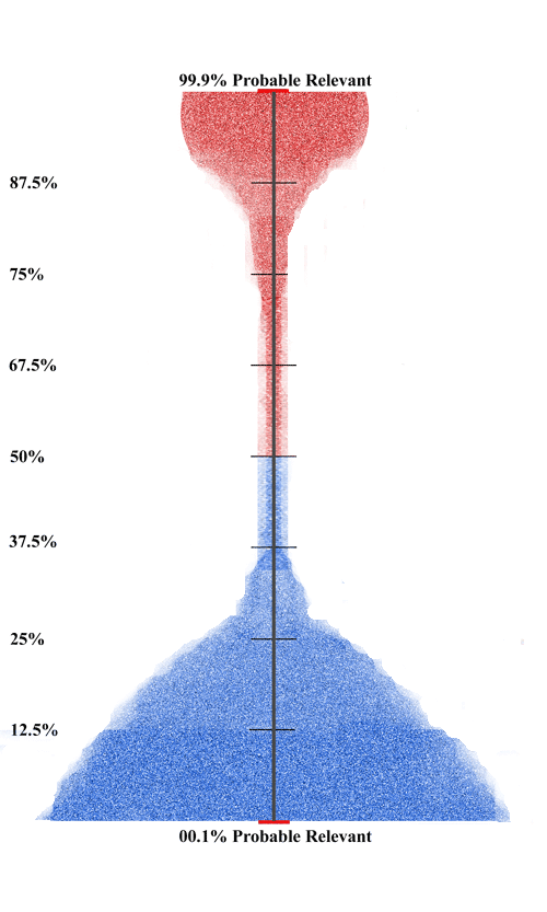 The second random sample comes next. That visualization, and a full description of the project, will be provided next week. In the meantime, leave your answers to the questions in the comments below. This is a chance to strut your stuff. If you prefer, send me your answers, and questions, by private email.
Reblogged this on The eDiscovery Nerd.
You might want to clarify what the vertical axis is measuring. Placing percentages adjacent to the words “Probable Relevant” may give people the impression that it is the probability of a document being relevant.
That is exact;y what I mean. The probability of relevance. That is what document ranking means.
Your gray cloud of documents is centered at 50%. If the probability of a document being relevant is 50% before you start training, your prevalence would be 50%, which contradicts “Assume that an SME reviewed the 1,534 sample and found that 384 were relevant…”
I suspect the percentages you are showing are relevance scores. High relevance score means high probability of being relevant, and low relevance score means low probability of being relevant, but the relevance score does not need to be equal to the probability of relevance. For some systems the relevance score is equal to the probability of the document being relevant, but for others it is not. You could take the probability of a document being relevant, square it, and then multiply it by the price of gasoline and you would have a perfectly good relevance score — the ordering of the documents would be exactly the same as it would be if your relevance score was equal to the probability, but you would risk making some bad decisions if you assumed that the numbers you were looking at were actually probabilities.
The answer to your question above is: 2.5% margin of error or a 5% confidence interval, at least prior to measuring the results of your sample. The sampling showed a 25% richness as you know.
Once you have sampled, and using a binomial calculator like http://statpages.org/confint.html, the confidence interval multiple would range from ,2288 to .2728 meaning the document range would be from 228,800 to 250,288. Or so I think.
But I don’t understand your graph. If the red docs were tagged as relevant and the blue as irrelevant, it looks like you had to tag most of the documents. I must be missing the key point.
Thanks for a fun post.
Way to go John! You are bold and correct (well almost).
The color just indicates predictions, not actual tagging by a human. Some may be human tagged, some not. Sometimes I have even had the computer disagree with my tagging. In fact this usually happens at least once in any large project. For example, I tag a document relevant, but the computer still gives it a 45% probable relevance ranking. It is a rare event, but it does happen. Most of the time I am right and the computer was just confused. But sometimes the computer is right and I discover I made a mistake (perhaps I missed a paragraph in a long document). Then I correct the mistake and change the tagging. The later event is humbling, but convincing. I described a couple of such events in the narrative of my Enron search.
[…] This is part two of my presentation of an idea for visualization of data in a predictive coding project. Please read part one first. […]
I guess I wasn’t clear. We are talking past each other. Who’s on first. Hopefully part two that I just posted will clear up the misunderstanding. If not, part three will for sure.
[…] of my presentation of an idea for visualization of data in a predictive coding project. Please read part one and part two first. This concluding blog in the visualization series also serves as a stand alone […]