 This is part two of my presentation of an idea for visualization of data in a predictive coding project. Please read part one first.
As most of you already know, the ranking of all documents according to their probable relevance, or other criteria, is the purpose of predictive coding. The ranking allows accurate predictions to me made as to how the documents should be coded. In part one I shared the idea by providing a series of images of a typical document ranking process. I only included a few brief verbal descriptions. This week I will spell it out and further develop the idea. Next week I hope to end on a high note with random sampling and math.
Vertical and Horizontal Axis of the Images
 The visualizations here presented all represent a collection of documents. It is supposed to be pointillist image, with one point for each document. At the beginning of a document review project, before any predictive coding training has been applied to the collection, the documents are all unranked. They are relatively unknown. This is shown by the fuzzy round cloud of unknown data.
Once the machine training begins all documents start to be ranked. In the most simplistic visualizations shown here the ranking is limited to predicted relevance or irrelevance. Of course, the predictions could be more complex, and include highly relevant and privilege, which is what I usually do. It could also include various other issue classifications, but I usually avoid this for a variety of reasons that would take us too far astray to explain.
Once the training and ranking begin the probability grid comes into play. This grid creates both a vertical and horizontal axis. (In the future, we could add third dimensions too, but let’s start simple.) The one public comment received so far stated that the vertical axis on the images showing percentages adjacent to the words “Probable Relevant” might give people the impression that it is the probability of a document being relevant. Well, I hope so, because that is exactly what I was trying to do!
The vertical axis shows how the documents are ranked. The horizontal axis shows the number of documents, roughly, at each ranking level. Remember, each point is supposed to represent a specific, individual document. (In the future we could add family overlays, but again, let’s start simple.) A single dot in the middle would represent one document. An empty space would represent zero documents. A wide expanse of horizontal dots would represent hundreds or thousand of documents, depending on the scale.
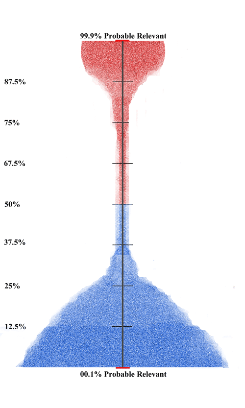
The diagram below visualizes a situation common where ranking has just begun and the computer is uncertain as to how to classify the documents. It classifies most in the 37.5% to 67.5% range of probable relevance. It is all about fifty fifty at this point. This is the kind of spread you would expect to see if training began with only random sampling input. The diagram indicates that the computer does not really know much yet about the data. It does not yet have any real idea as to which documents are relevant, and which are not.

The vertical axis of the visualization is the key. It is intended to show a running grid from 99% probable relevant to 0.01% probable relevant. Note that 0.01% probable relevant is another way of saying 99.9% probable irrelevant, but remember, I am trying to keep this simple. More complex overlays may be more to the liking of some software users. Also note that the particular numbers I show on the these diagrams is arbitrary: 0.01%, 12.5%, 25%, 37.5%, 50%, 67.5%, 75%, 87.5%, 99.9%, I would prefer to see more detail here, and perhaps add a grid showing a faint horizontal line at every 10% interval. Still, the fewer lines shown here does have a nice aesthetic appeal, plus it was easier for me to create on the fly for this blog.
Again, let me repeat to be very clear. The vertical grid on these diagrams represents the probable ranking from least likely to be relevant on the bottom, to most likely on the top. The horizontal grid shows the number of documents. It is really that simple.
Why Data Visualization Is Important
 This kind of display of documents according to a vertical grid of probable relevance is very helpful because it allows you to see exactly how your documents are ranked at any one point in time. Just as important, it helps you to see how the alignment changes over time. This empowers you to see how your machine training impacts the distribution.
This kind of direct, immediate feedback greatly facilitates human computer interaction (what I call in my approximate 50 articles on predictive coding the hybrid approach). It makes it easier for the natural human intelligence to connect with the artificial intelligence. It makes it easier for the human SMEs involved to train the computer. The humans, typically attorneys or their surrogates, are the ones with the expertise on the legal issues in the case. This visualization allows them to see immediately what impact particular training documents have upon the ranking of the whole collection. This helps them to select effective training documents. It helps them to attain the goal of separation of relevant from irrelevant documents. Ideally they would be clustered on both the bottom and top of the vertical axis.
For this process to work it is important for the feedback to be grounded in actual document review, and not be a mere intellectual exercise. Samples of documents in the various ranking strata must be inspected to verify, or not, whether the ranking is accurate. That can vary from strata to strata. Moreover, as everyone quickly finds out, each project is different, although certain patterns do tend to emerge. The diagrams used as an example in this blog represent one such typical pattern, although greatly compressed in time. In reality the changes shows here from one diagram to another would be more gradual and have a few unexpected bumps and bulges.
Visualizations like this will speed up the ranking and the review process. Ultimately the graphics will all be fully interactive. By clicking on any point in the graphic you will be taken to the particular document or documents that it represents. You click and drag and you are taken to a whole set of documents selected. For instance, you may want to see all documents between 45% and 55%, so you would select that range in the graphic. Or you may want to see all documents in the top 5% probable relevance ranking, so you select that top edge of the graphic. These documents will instantly be shown in the review database. Most good software already has document visualizations with similar linking capacities. So we are not reinventing the Wheel here, just applying these existing software capacities to new patterns, namely to document rankings.
These graphic features will allow you to easily search the ranking locations. This will in turn allow you to verify, or correct, the machine’s learning. Where you find that the documents clicked have a correct prediction of relevance, you verify by coding as relevant, or highly relevant. Where the documents clicked have an incorrect prediction, you correct by coding the document properly. That is how the computer learns. You tell it yes when it gets it right, and no when it gets it wrong.
At the beginning of a project many predictions of relevance and irrelevance will be incorrect. These errors will diminish as the training progress, as the correct predictions are verified, and erroneous predictions are corrected. Fewer mistakes will be made as the machine starts to pick up the human intelligence. To me it seems like a mind to computer transference. More of the predictions will be verified, and the document distributions will start to gather on both end of the vertical relevance axis. Since the volume of documents is represented by the horizontal axis, more documents will start to bunch together at both the top and bottom of the vertical axis. Since document collections in legal search usually contain many more irrelevant documents than relevant, you will typically see most documents on the bottom.
Visualizations of an Exemplar Predictive Coding Project
In the sample considered here we see unnaturally rapid training. It would normally take many more rounds of machine training than are shown in these four diagrams. In fact, with a continuous active training process, there could be hundreds of rounds per day. In that case the visualization would look more like an animation than a series of static images. But again, I have limited the process here for simplicity sake.
 As explained previously, the first thing that happens to the fuzzy round cloud of unknown data before any training begins is that the data is processed, deduplicated, deNisted, and non-text and other documents unsuitable for analytics are removed. In addition other necessarily irrelevant documents to this particular project are bulk-culled out. For example, ESI such as music files, some types of photos, and many email domains, like, for instance, emails from publications such as the NY Times. By good fortune in this example exactly One Million documents remain for predictive coding.
 We begin with some multimodal judgmental sampling, and with a random sample of 1,534 documents. (They are the yellow dots.) Assuming a 95% confidence level, do you know what confidence interval this creates? I asked this question before and repeat it again, as the answer will not come until the final math installment next week.
Next we assume that an SME, and or his or her surrogates, reviewed the 1,534 sample and found that 384 were relevant and 1,150 were irrelevant. Do you know what prevalence rate this creates? Do you know the projected range of relevant documents within the confidence interval limits of this sample? That is the most important question of all.
Next we do the first round of machine training proper. The first round of training is sometimes called the seed set. Now the document ranking according to probable relevance and irrelevance begins. Again for simplicity sake, we assume that the analytics is directed towards relevance alone. In fact, most projects would also include high-relevance and privilege.
 In this project the data ball changed to the following distribution. Note the lighter colors represent less density of documents. Red documents represent documents coded or predicted as relevant, and blue as irrelevant. All predictive coding projects are different and the distributions shown here are just one among near countless possibilities. Here there are already more documents trained on irrelevance, than relevance. This is in spite of the fact that the active search was to find relevant documents, not irrelevant documents. This is typical in most review projects where you have many more irrelevant than relevant documents overall, and where it is easier to spot and find irrelevant than relevant.
 Next we see the data after the second round of training. The division of the collection of documents into relevant and irrelevant is beginning to form. The largest of collection of documents are the blue points at the bottom. They are the documents that the computer predicts are irrelevant based on the training to date. There are also a large collection of points shown in red at the top. They are the ones where the computer now thinks there is a high probability of relevance. Still, the computer is uncertain about the vast majority of the documents: the red in the third strata from the top, the blue in the third strata from the bottom, and the many in the grey, the 37.5% to 67.5% probable relevance range. Again we see an overall bottom heavy distribution. This is a typical pattern because it is usually easier to train on irrelevance than relevance.
As noted before, the training could be continuous. Many software programs offer that feature. But I want to keep the visualizations here simple, and not make an animation, and so I do not assume here a literally continuous active learning. Personally, although I do like to keep the training continuous throughout the review, I like the actual computer training to come in discrete stages that I control. That gives me a better understanding of the impact of my machine training. The SME human trains the machine, and, in an ideal situation, the machine also trains the SME. That is the kind of feedback that these visualizations enhance.
 Next we see the data after the third round of training. Again, in reality it would typically take more rounds of training than three to reach this relatively mature state, but I am trying to keep this example simple. If a project did progress this fast, it would probably be because a large number of documents were used in the prior rounds. The documents about which the computer is now uncertain — the grey area, and the middle two brackets — is now much smaller.
The computer now has a high probability ranking for most of the probable relevant and probable irrelevant documents. The largest number of documents are the blue bottom, where the computer predicts they have a near zero chance of being classified relevant. Again, most of the probable predictions, those in the top and bottom three brackets, are located in the bottom three brackets. Those are the documents predicted to have less that a 37.5% chance of being relevant. Again, this kind of distribution is typical, but there can be many variances from project to project. We here see a top loading where most of the probable relevant documents are in the top 12.5% percent ranking. In other words, they have an 87.5% probable relevant ranking, or higher.
 Next we see the data after the fourth round of training. It is an excellent distribution at this point. There are relatively few documents in the middle. This means there are relatively few documents about which the computer is uncertain as to its probable classification. This pattern is one factor among several to consider in deciding whether further training and document review are required to complete your production.
Another important metric to consider is the total number of documents found to be probable relevant, and comparison with the random sample prediction. Here is where math comes in, and understanding of what random sampling can and cannot tell you about the success of a project. You consider the spot projection of total relevance based on your initial prevalence calculation, but much more important, you consider the actual range of documents under the confidence interval. That is what really counts when dealing with prevalence projections and random sampling. That is where the plus or minus confidence interval comes into play, as I will explain in detail the third and final installment to this blog.
 In the meantime, here is the document count of the distribution roughly pictured in the final diagram above, which to me looks like an upside down, fragile champagne glass. We see that exactly 250,000 documents have a 50% or higher probable relevance ranking, and 750,000 documents have a 49.9% or less probable relevance ranking. Of the probable relevant documents, there are 15,000 documents that fall in the 50% to 67.5% range. There are another 10,000 documents that fall in the 37.5% to 49.9% probable relevance range. Again, this is also fairly common as we often see less on the barely irrelevant side that we do on the barely relevant side. As a general rule I review with humans all documents that are 50% or higher probable relevance, and do not review the rest. I do however sample and test the rest, the documents with less than a 50% probable relevance ranking. Also, in some projects I review far less than the top 50%. That all depends on proportionality constraints, and document ranking distribution, the kind of distributions that these visualizations will show.
In addition to this metrics analysis, another important factor to consider in whether our search and review efforts are now complete, is how much change in ranking there has been from one training round to the next. Sometimes there may be no change at all. Sometimes there may only be very slight changes. If the changes from the last round are large, that is an indication that more training should still be tried, even if the distribution already looks optimal, as we see here.
Another even more important quality control factor is how correct the computer has been in the last few rounds of its predictions. Ideally, you want to see the rate of error decreasing to a point where you see no errors in your judgmental samples. You want your testing of the computer’s prediction to show that it has attained a high degree of precision. That means there are few documents predicted relevant, that actual review by human SMEs show are in fact irrelevant. This kind of error is known as a False Positive. Much more important to quality evaluation is to the discovery of documents predicted irrelevant, that are actually relevant. This kind of error is known as a False Negative. The False Negatives are your real concern in most projects because legal search is usually focused on recall, not precision, at least within reason.
The final distinction to note in quality control is one that might seem subtle, but really is not. You must also factor in relevance weight. You never want a False Negative to be a highly relevant document. If that happens to me, I always commence at least one more round of training. Even missing a document that is not highly relevant, not hot, but is a strong relevant document, and one of a type not seen before, is typically a cause for further training. This is, however, not an automatic rule as with the discovery of a hot document. It depends on a variety of factors having to do with relevance analysis of the particular case and document collection.
In our example we are going to assume that all of the quality control indicators are positive, and a decision has been made to stop training and move on to a final random sample test.
A second random sample comes next. That test and visualization will be provided next week, along with the promised math and sampling analysis.
Math Quiz
I part one, and again here, I asked some basic math questions on random sampling, prevalence, and recall. So far no one has attempted to answer the questions posed. Apparently, most readers here do not want to be tested. I do not blame them. This is also what I find in my online training program, e-DiscoveryTeamTraining.com, where only a small percentage of the students who take the program elect to be tested. That is fine with me as it means one less paper to grade, and most everyone passes anyway. I do not encourage testing. You know if you get it or not. Testing is not really necessary.
The same applies to answering math questions in a public blog. I understand the hesitancy. Still, I hope many privately tried, or will try, to solve the questions and came up with the correct answers. In part three of this blog I will provide the answers, and you will know for sure if you got it right. There is still plenty of time to try to figure it out on your own. The truly bold can post it online in the comments below. Of course, this is all pretty basic stuff to try experts of this craft. So, to my fellow experts out there, you have yet another week to take some time and strut your stuff by sharing the obvious answers. Surely I am not the only one in the e-discovery world bold enough to put their reputation on the line by sharing their opinions and analysis in public for all to see (and criticize). Come on. I do it every week.
Math and sampling are important tools for quality control, but as Professor Gordon Cormack, a true wizard in the area of search, math, and sampling likes to point out, sampling alone has many inherent limitations. Gordon insists, and I agree, that sampling should only be part of a total quality control program. You should never just rely on random sampling alone, especially in low prevalence collections. Still, when sampling, prevalence, and recall are included as part of an overall QC effort, the net effect is very reassuring. Unless I know that I have an expert like Gordon on the other side, and so far that has never happened, I want to see the math. I want to know about all of the quality control and quality assurance steps taken to try to find the information requested. If you are going to protect your client, you need to learn this too, or have someone at hand who already knows it.
This kind of math, sampling, and other process disclosures should convince even the most skeptical adversary or judge. That is why it is important for all attorneys involved with legal research to have a clear mathematical understanding of the basics. Visualizations alone are inadequate, but, for me at least, visualizations do help a lot. All kinds of data visualizations, not just the ones here presented, provide important tools to help lawyers to understand how a search project is progressing.
Challenge to Software Vendors
 The simplicity of the design of the idea presented here is a key part of the power and strength of the visualization. It should not be too difficult to write code to implement this visualization. We need this. It will help users to better understand the process. It will not cost too much to implement, and what it does cost should be recouped soon in higher sales. Come on vendors, show me you are listening. Show me you get it. If you have a software demo that includes this feature, then I want to see it. Otherwise not.
All good predictive coding software already ranks the probable relevance of documents, so we are not talking about an enormous coding project. This feature would simply add a visual display to calculations already being made. I could hand make these calculations myself using an Excel spreadsheet, but that is time consuming and laborious. This kind of visualization lends itself to computer generation.
I have many other ideas for predictive coding features, including other visualizations, that are much more complex and challenging to implement. This simple grid explained here is an easy one to implement, and will show me, and the rest of our e-discovery community, who the real leaders are in software development.
Conclusion
 The primary goal of the e-Discovery Team blog is educational, to help lawyers and other e-discovery professionals. In addition, I am trying to influence what services and products are provided in e-discovery, both legal and technical. In this blog I am offering an idea to improve the visualizations that most predictive software already provide. I hope that all vendors will include this feature in future releases of their software. I have a host of additional ideas to improve legal search and review software, especially the kind that employs active machine learning. They include other, much more elaborate visualization schemes, some of which have been alluded to here.
Someday I may have time to consult on all of the other, more complex ideas, but, in the meantime, I offer this basic idea for any vendor to try out. Until vendors start to implement even this basic idea, anyone can at least use their imagination, as I now do, to follow along. These kind of visualizations can help you to understand the impact of document ranking on your predictive coding review projects. All it takes is some idea as to the number of documents in various probable relevance ranking strata. Try it on your next predictive coding project, even if it is just rough images from your own imagination (or Excel spreadsheet). I am sure you will see for yourself how helpful this can be to monitor and understand the progress of your work.
Assuming 25% richness based on the sample (you don’t indicate whether the multimodal sampling documents were included in the 1534, or how many of those there were, so figure total sampling size of 1534), 95% confidence would give you a confidence interval of 22.83% to 27.17% richness. Which, interestingly enough, you can get from a calculator programmed to spit these numbers out, without really understanding for example how confidence interval varies with sample size. And since this interval is a factor in the probability projections, one could imagine a version of your visualization that made this apparent: “This is your spread, but given the variation possible, it could look like this (low end) or like this (high end).”
A valuable feature of your visualization is that it works for both kinds of systems–those that only make rankings, and those that also make yes/no predictions. You get to see the prevalence of predictions and the distribution of rankings at one glance.
Your narrative suggests two other useful visualizations: first, that of change in ranking from one round to the next. If I understand the text correctly, you would be looking for that curve to flatline, demonstrating a diminishing return from successive training rounds. This would give you another visual indicator that you were done. Second, the “turnover rate”, or the number of corrections to computer predictions after each round of training. This is another indicator you would want to see trending to zero or at least not increasing, right? This is starting to look like a nice dashboard to work with.
I agree that visualizations alone are not enough, but my experience is that effective, right-brain-oriented visualizations of these relationships are fabulously compelling for attorneys managing reviews. The best ones make the relationships obvious, and attorney/reviewers “get” them long before they become fluent in the actual math. As in biofeedback training, just seeing the readout helps the subject know intuitively what to do next.
You would think vendors would be all over this. This does not seem to be the case, however–there seems to be a much more entrenched (legacy?) left-brain sensibility that wants to display status in matrixes and text boxes for us to figure out. Nikon’s needle-matching exposure guide was far more effective than simply displaying f-stop and shutter speed.
[…] of an idea for visualization of data in a predictive coding project. Please read part one and part two first. This concluding blog in the visualization series also serves as a stand alone lesson on the […]
[…] the data visualization diagram I explained in Visualizing Data in a Predictive Coding Project – Part Two (shown right) you could exclude some bottom portion of the ranked documents shown in blue. You […]